Dissect user, dev and deployment docs; add frontpage #545
Dissect user, dev and deployment docs; add frontpage #545dennisreimann wants to merge 9 commits into
Conversation
|
Thats looking awesome... @dennisreimann |
|
Just that small thing has broken up complicated docs, into more fun and searchable docs, thanks Dennis For noobs, instructing should always be kept very simple!! For nerds, let them have it, in every detail. Under the hood. 🙏 |
|
Thanks for the concept Dennis. I need to think about this a bit more, while in theory it sounded okay, I'm unsure if a change like this would cause more people not reading the docs. Don't have any concrete feedback right now unfortunately. Need to gather my thoughts and just think if there's another way to tackle the separation that's not as disruptive. |
|
@dennisreimann I think it looks awesome! I think one of the more challenging parts of this change would be to go through and decide what is dev vs. user docs but that distinction has been discussed elsewhere. Also changing links in the docs/UI is super painful, if that is needed to split the docs.. I guess that is a drawback, but it seems we're wanting to make this change either way. Overall though, I really like it. @pavlenex I don't see why search would be too much of an issue. That is what we are expecting users to do in FAQ already. I'm also using the overall search quite often as well. I think it should be clear to the user which doc to choose.
I disagree :) |
Because you exclusively rely on a search to provide a solution to a problem, and if it is not good enough, you expect people to click To be clear my argument is not against this layout. I'd just like to take some time to figure out if the initial idea has oversimplified how people interact with documentation.
So I'd like us to figure out a proper fallback way. By the way relying on search means we have to do quite a lot of work on improving wording and adapting our FAQ especially to match exclusive search phrases people use. Not an easy task and would require lots of trial and error, but possible. Maybe at the bottom of the page (footer) we can provide some sort of structure that can lead user. Any ideas guys? |
|
I think there are two things here, how we use the search, keywords and metadata can help this here, and I like how GitHub and these other companies deal with search. which I find very clear. ask it a question .. u can see the results.. this a good example of search function. https://developer.squareup.com/docs https://docs.blockstream.com/index.html and the other thing is I like @britttttk said "I think one of the more challenging parts of this change would be to go through and decide what is dev vs. user docs but that distinction has been discussed elsewhere." The BTCPay UI interface is quite simple and logical. explaining this should be kept short and simple. because the end user just wants to get going. Noob or Advance.. learn as you go. I think in time, after the updates, the docs will be awesome. |
|
This is what I was referring to when I said adding more navigation links in the landing page, below user vs dev docs, as most people may not know what goes where and search may not always provide an answer. |
|
For that we could have a link list or a tailored introduction section on the homepage, where we link to often looked up pages – hence leading the user into the guide where they can explore more. Again: this isn‘t meant to be perfect in its current form, but I wanted to get us going discussing this further and in a more concrete form. That part of the mission seems accomplished 😀 |
Nice one @Eskyee & @pavlenex that would be really good to have those general buttons on the landing page. I guess we would need to brainstorm what we might want our "main pages to be". It might be hard though for a topic if both User and Dev have the same section. For example Deployment could be both User and Dev. But yes I think us relying on the search is also mainly possible because we know what to search for in most cases. Users are gong to be searching things like "doesn't start" and "doesn't connect". I definitely agree our search can't solve problems like that very easily. |
|
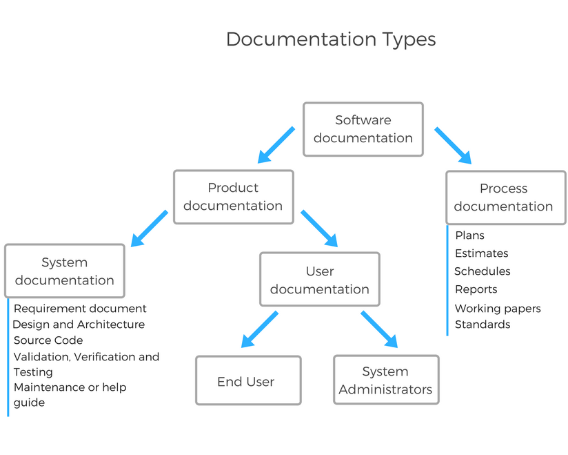
Product: User documentation I found this interesting @britttttk @pavlenex @dennisreimann https://blog.prototypr.io/software-documentation-types-and-best-practices-1726ca595c7f |
|
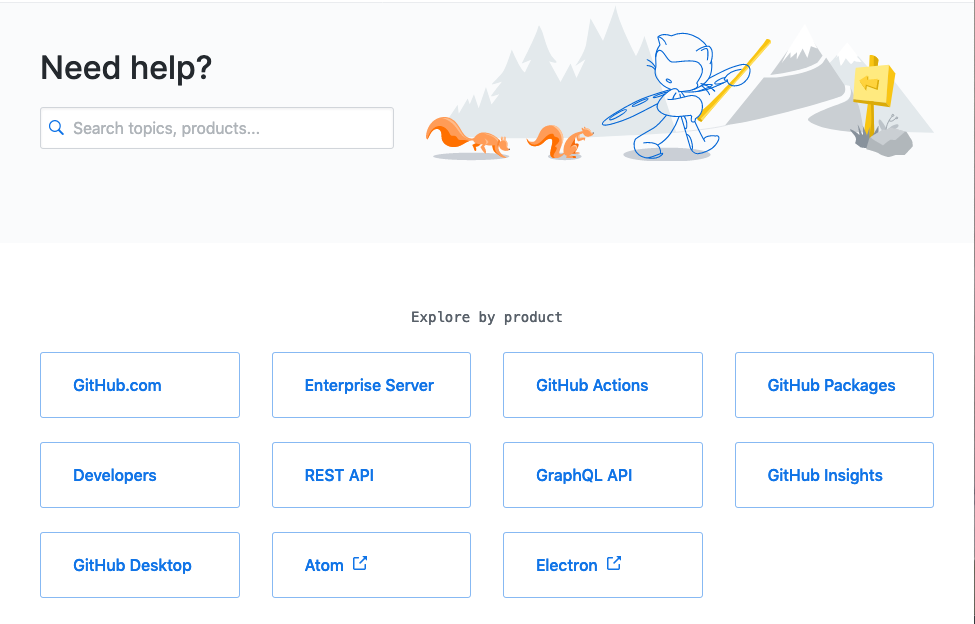
As for the start screen and directly linking to the most important sections: I like how GitHub does it …
|
|
@dennisreimann Me too. Simple and clear. |
|
@pavlenex Shall I go ahead, rebase the branch and tinker with that or how do we want to proceed here? |
|
It's cool concept imo, and I think it's good idea to go ahead, at least so we can visualize how it can look on our end. Maybe no need to rush merging it in, since in a way it's a big navigational change for people. |
I love how they did it. |
|
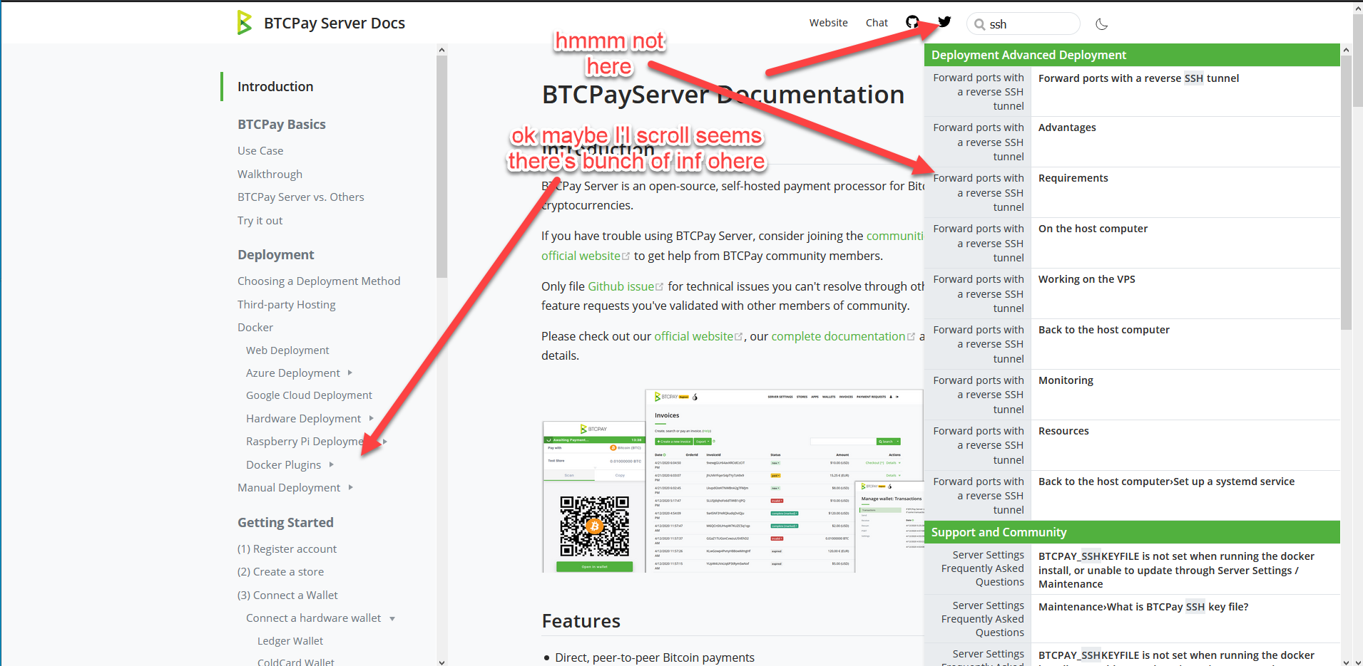
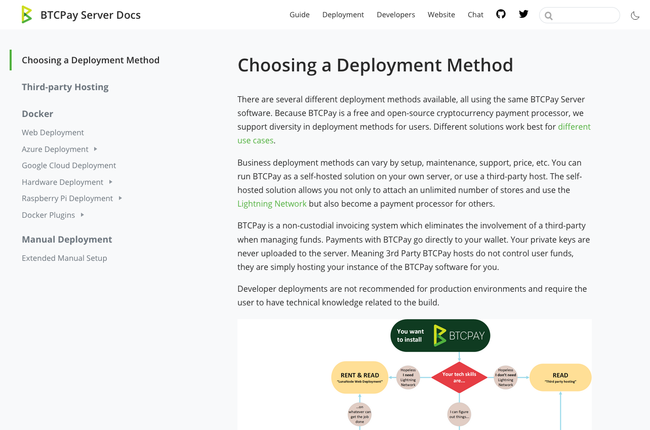
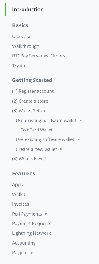
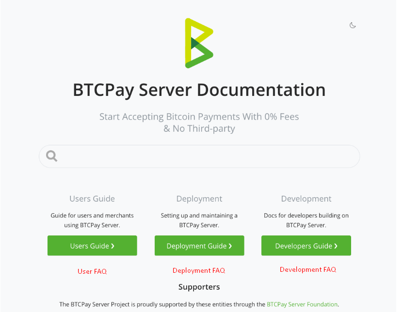
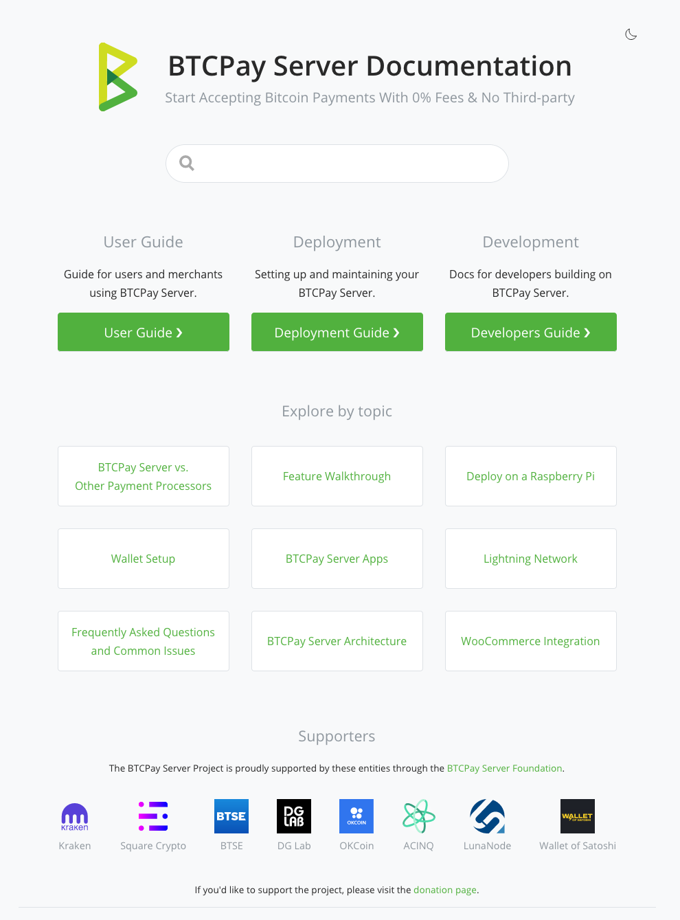
I've updated the branch and reworked the structure a bit. To not loose SEO juice and keep the old links working, the users guide now stays at the root of the site, instead of living inside the guide directory. Way better and makes rebasing with master easier. Also the development section now has a better structure. Next I played around a bit and would like to hear your thoughts on also extracting the Deployment section. It is a big part of the docs and setup/maintenance to me feels like a whole topic in itself. That's why I've come up with the following … Home
SectionThis section is linked to in the header and also has a navbar on its own …
Guide NavbarExtracting the Deployment section imho gives a more interesting flow from the users perspective in the guide then …
Haven't pushed this yet, but would invite feedback and am curious to know your thoughts. |
|
nice work, love the layout design, and the idea of reducing information overload, with the sections. the Guide Navbar flow is important, nice touch. a great update, & attention to detail. makes you think much faster and clear on the direction to take. @dennisreimann |
|
maybe I would try & greyscale the logos as a second idea. might give us a cleaner looking page. @dennisreimann |

|
I really like the It looks neat and the differentiation is, IMHO enough for anyone to understand what they are likely to find in the corresponding docs. Also, a bit of feedback on the header menu: Finally, a personnel though: Would it be worth-while to differentiate FAQ's as well ?
|
|
I'm not sure I'm 100% for this until our search preforms better. I like the layout but I think it won't provide best experience for someone searching for an answer. The current docs have structure and links, so even if search lets you down, you can navigate up and down to find a link that may helpful. Current layout looks great but I'm afraid people will get lost as they land on the page. We either need more links after the main 3 CTA's or improve our search results. With this sort of layout we're hoping user arrives to this page, gets a reply in search (which is imo quite unlikely the way our search now looks) or knows the difference between deployment, user etc. Every user needs I think this is a good starting point, but needs more eyes on this and actual tests. Also if I may suggest, I don't think it's good idea to merge this until our dev docs are fully complete, right now dissecting docs without having proper dev docs makes no sense to me. Perhaps if within the box we provide a CTA with links to sub-sections, it can be a good compromise. Example. This example also provides how sidebar can help in landing page navigation. It doesn't look clean, but imo it provides better navigation. Just some feedback for brainstorming, I am not against this, just think it needs UX people to look at it as well as actual users who're looking for particular info. Remember docs are there to help people and reduce support on our end, and if people come to chat asking where to find stuff in docs, then we failed. |
|
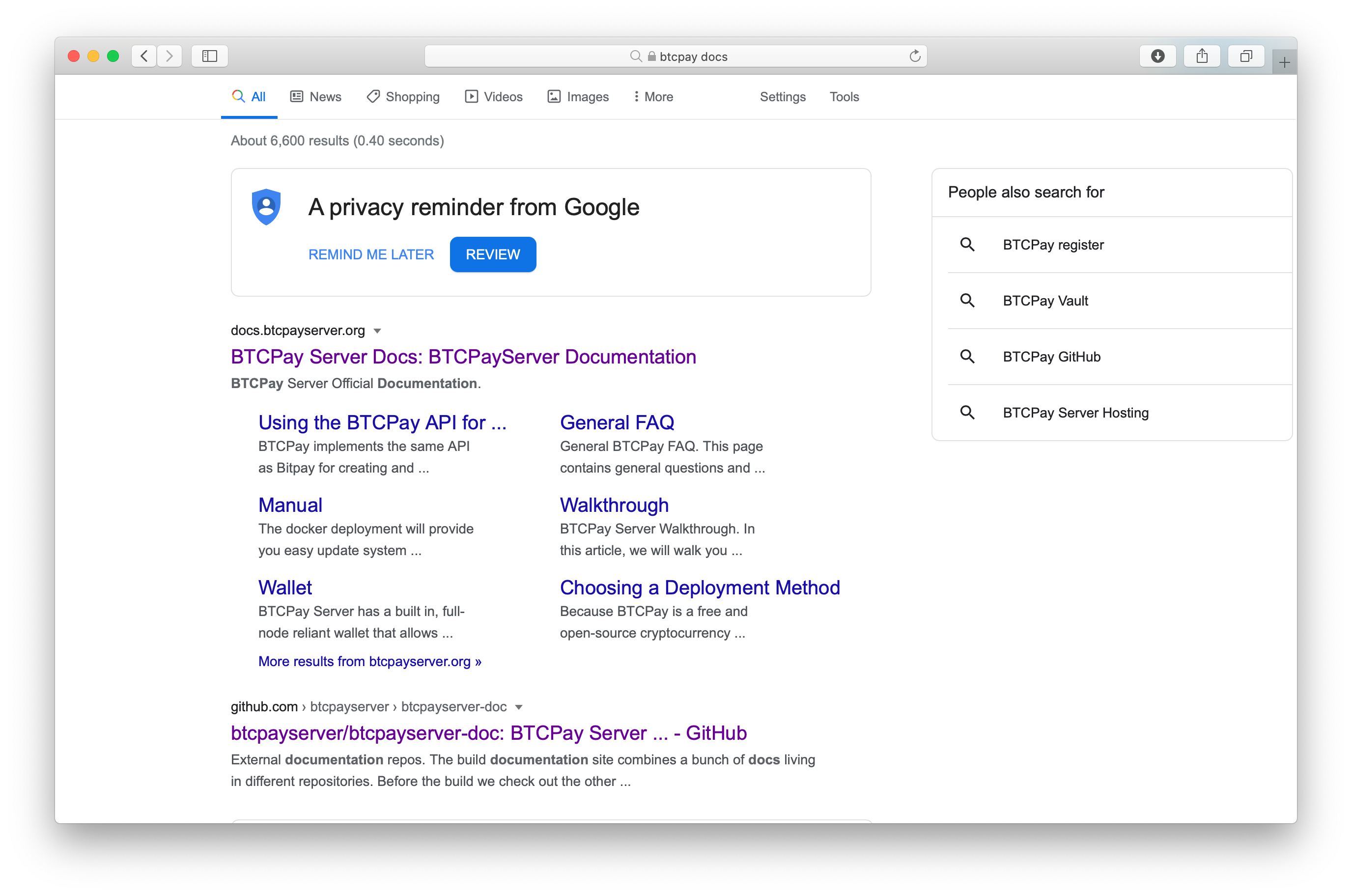
ok yes its good to brainstorm this, as for now look from a google search user as a example.
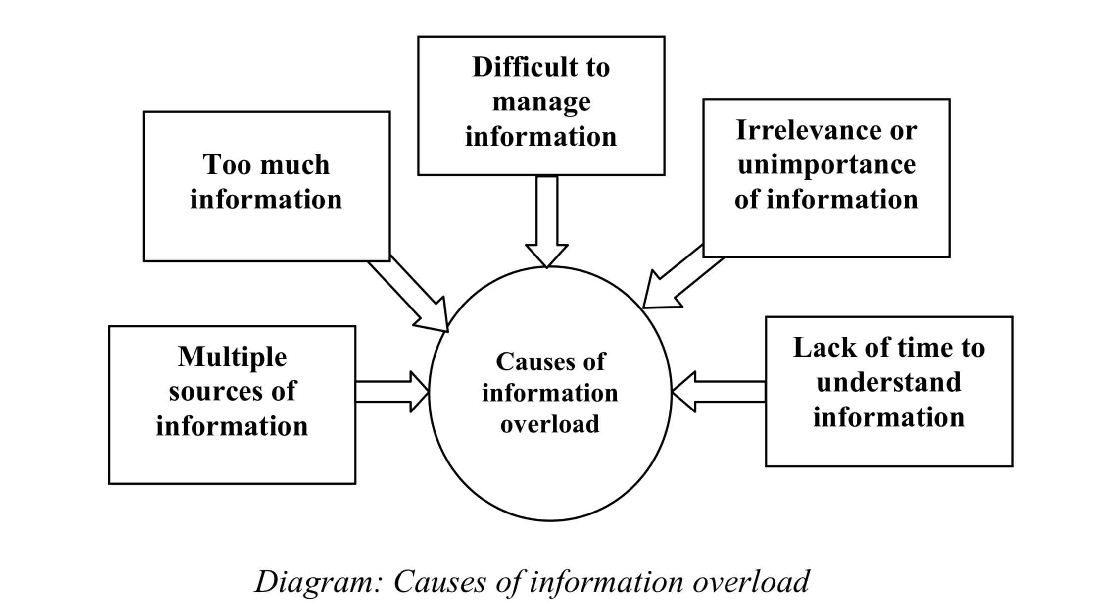
I think the art to good design UX & learning, is to give the user what they need at that moment. and not overload the user to think more than needed to complete their task or find a solution.. I don't think people will get lost arriving to documents when it becomes logical and Instinctive.. that's great design.. no need to ask support! unless reporting a bug! What is simplicity in design? great information !! rule 101 of UX but as a refresher, make sure we know who are users are, how they will be using the product and what they are trying to achieve so we can work out how best to simplify the product to their needs. Simple is complex to get right and it will take time and many iterations. Keep referring back to initial research to make sure we haven’t gone off- piste and use user research to make sure the original idea has not been lost through over-simplification.
|
|
Microsoft search function is powerful and works fine, as a example in documentation they use metadata search. .. https://docs.microsoft.com/en-gb/visualstudio/?view=vs-2019 Also adding this to our documents if a search term doesn’t provide a answer.. Ask a human Can't find what you're looking for? Contact us |
There are two things I'm struggling with in regards to this:
One thing that is still missing too is the part I refered to with this comment, in which we highlight the most looked for topics and make them also directly accessible on the homepage. Those would need to be defined and I wanted to discuss the additional deployment section first, because it feels relevant for this part too. However, I'll let this rest for now until we've gathered more feedback and can decide on an approach to finish this up. |
Search
Agree, perhaps we should create a separate discussion issue Landing page
Agree, it should be
I think we should create a developer FAQ regardless :) but I am open to the way @Zaxounette has suggested it in the landing page. Deployment as a Main Section
I would say deployment is the biggest barrier to entry for anyone wanting to use this software. As it has been pointed out everyone needs to do it. I agree, and this is why imo it should be prominently displayed. I also fully agree with Esky's comment that these docs will also be largely completely avoided after they have deployed. The exception is FAQ, which honestly most of the deployment maintenance FAQ questions should be in the dev section anyways... Docs UXI agree with Esky, we should try to not expose all things to the user.. but try to help them discover what they are looking for. I think by now we have all looked at several websites and have discovered Github docs are very clean looking compared to others, and the reason is because it abstracts away most unnecessary info. A good example is Pull Payments docs. This is very likely to be more in the "power users" realm of btcpay (at least for now). Create a store and invoices is more for say, beginner users. So how can we help users have a good docs experience based on their use case and user level? We have already partitioned the docs into user stories, but what about user level? Deployment (1), User Guide (2), Development (3) seem to me good ways of doing a "user level" concept.
|
|
Users don't need docs to discover stuff, this is not a RPG game, they want answers to their questions quick. If there's no clear navigation, I don't see how we can expect users to know where to find their answers, especially because the search provides so many confusing results at once in most cases. I suggest we keep the sidebar for navigation and mix that with what you guys suggested already for the front page. I also suggest you guys to take note on how often do you find yourself using search vs using navigation on the left. For me search provides so man irrelevant results that in 90% of cases I use the navigation in the sidebar to find my answer. I can only imagine how it's for newbs. I definitely would not rush with this one until we get more user feedback. |
I get this, but on the other hand the current sidebar contains all topics at once. This also provides no guidance, which we could accomplish by separating the individual sections (each of the having their on sidebar). My point here is not to say is above is perfect, but to highlight that the current navigation might also be confusing as it overwhelms with this all-in-one approach.
Agreed, so let's go ahead, define what we want and see how we can tweak the Algolia settings – maybe there are some low hanging fruits there like not providing 25 results … |
|
😂 RPG game .. that’s a good one ☝️ Humans can hold only four or five items in their conscious awareness, or working memory, at one time. Overloading that capacity causes the neurological juggling act behind working memory to fall apart. Discovery is how we understand life. And how we store that memory. 🤓🧐
|
|
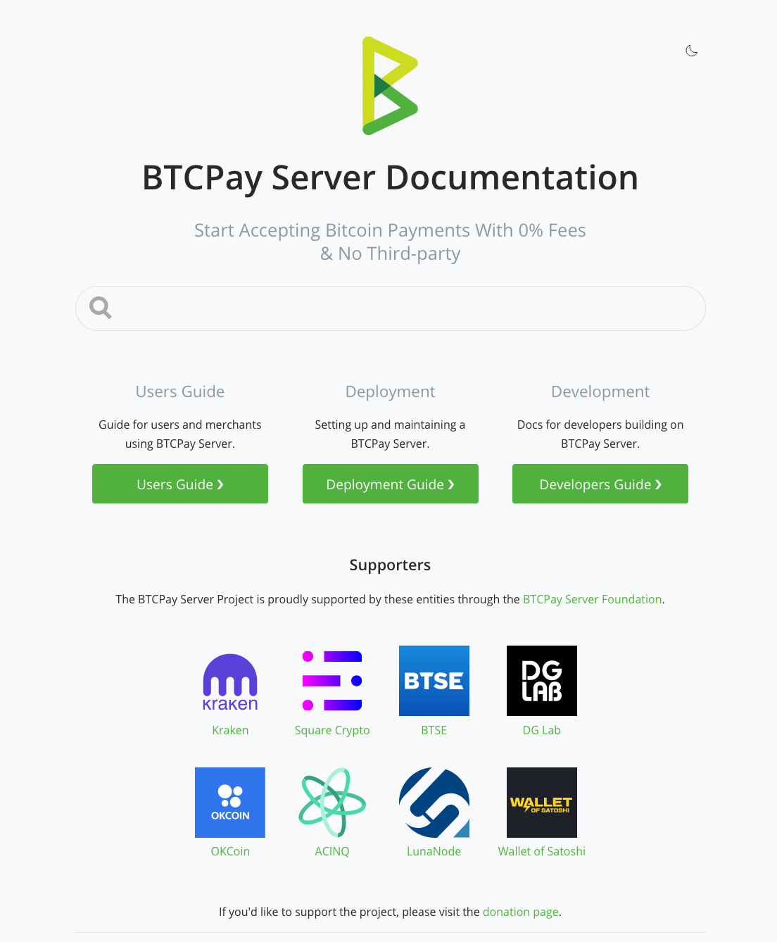
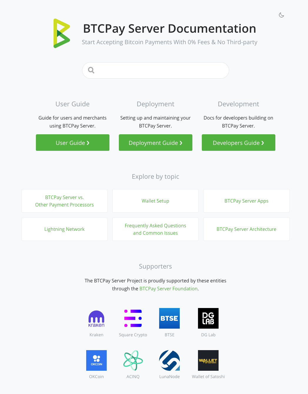
Ok, I refined this a bit, incorporating all of the feedback – thanks for taking the time to elaborate on your points! The "Explore by topic" links are exemplary – we can define what we want to have there in further discussion. Light
Dark
|
|
@dennisreimann Great! I'd probably add more section to explore by topic and make supporters logos in 1 row, smaller and less visible, there's no need to display them as prominnelty so it distracts from docs usability imo. |
|
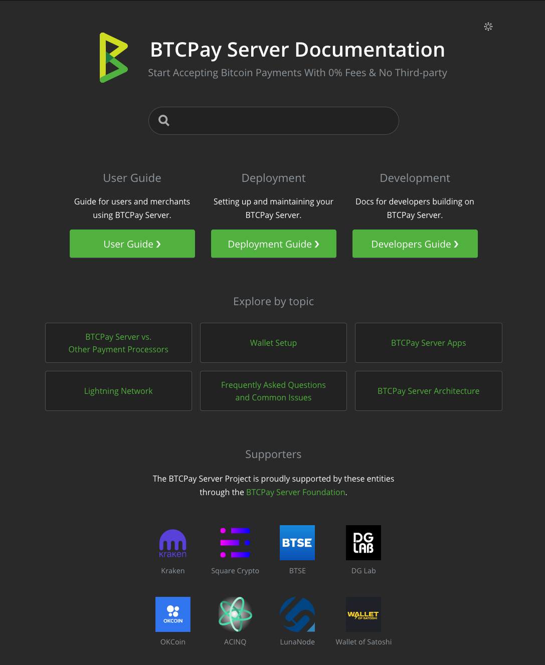
Ok, here we go…
|
|
Nice work 🙌 |
|
Nice <3 What about the FAQ (single or multiple) section ? |
I'd keep the FAQs associated with the individual sections. For more it makes most sense this way, but let's discuss this too. |
Well multiple FAQ sections then 😄 Seriously, I was referring to my "screenshot" and Pav's mockup, both containing sections pointing to a FAQ, or multiple FAQ"s directly in the home page. Also, semantics question here: Why call each section a guide ? Why not just call them docs ? (As in |
I agree with this one. |
Ok, will fix this once we are near finishing this one :) |
Draft/POC for #501.

fix

fix

fix

fix

fix
|
Updated the branch and incorporated the feedback. Also taking it out of draft mode, because everything is basically here. One thing we haven't discussed and might want to change ist the list of topis on the frontpage. Just let me know what should be featured there and I'll update the list as well. I don't want to be pushy with this, but from what I see we can't go on from here with assumptions. We could ship it, see what people think, gather feedback and improve it from there. |
|
IMO this change will make sense once our docs are good enough. Differentiating docs when our dev docs and search on which we want to really on are really bad makes no sense to me at this point in time. So, personally I'd hold this on until we analyze and adjust content that will lead to better search result and when we have a proper dev docs. I think people need to test this locally and not provide feedback based on the image. I've been testing it regularly and I juts don't think it's an improvement in terms of usability the way it is now. This is not the question of your design or code, it's more like we need to do a bunch of improvements in docs so that structure like this makes sense. |
|
Okay, so to summarize (and to dumb down for my brain), the identified goals that you stated Pav are the following:
Could 4 be clarified ?
|
Basically the bullet points you already outlined quite well. But on top of that, we'd have to have keywords in titles that people are asking, which is related to bullet point 2. |
Thanks :) |
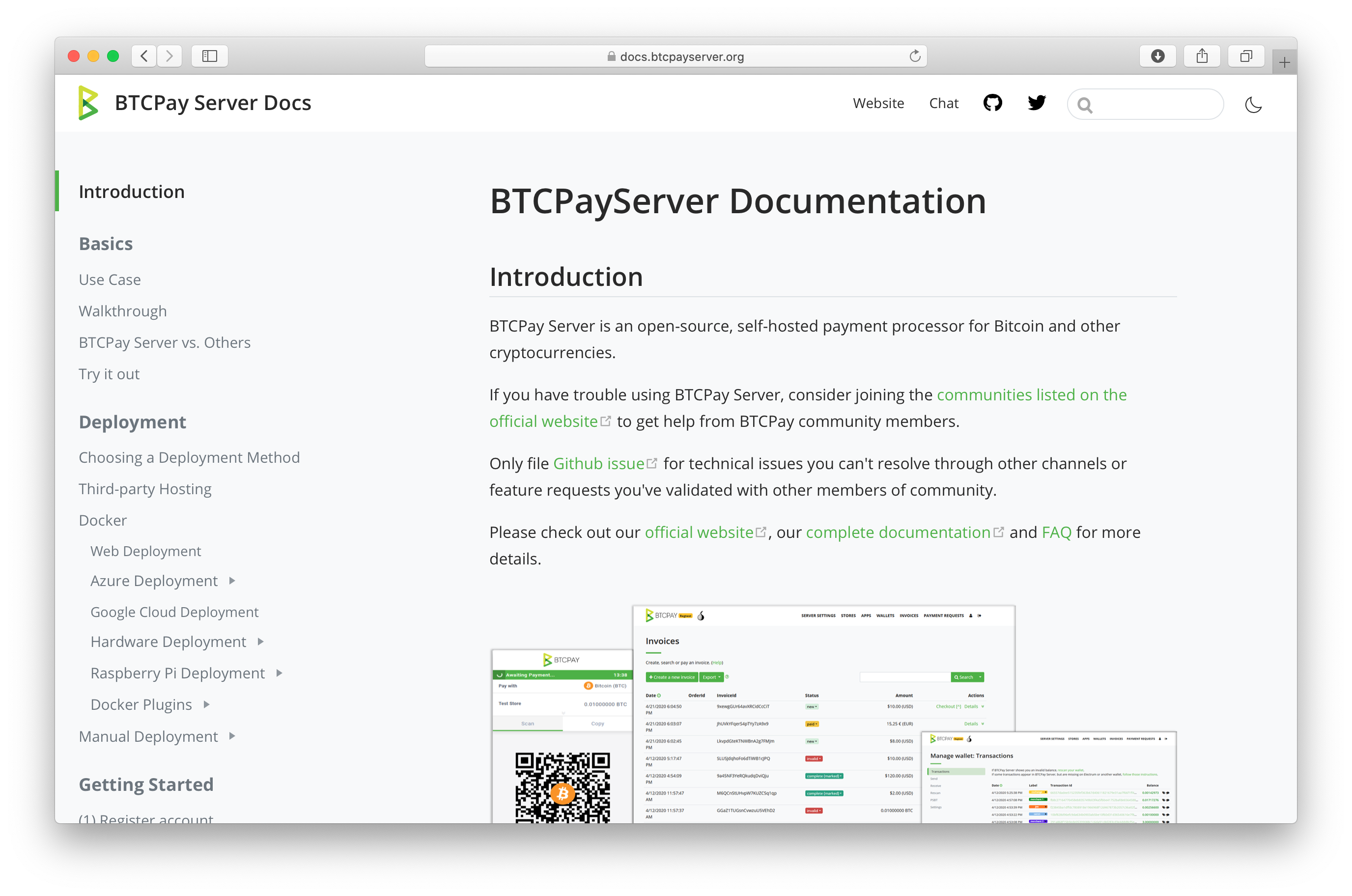
This is a draft/proof of concept for how to tackle #501. I've implemented it to provide something we can click through and discuss.
Main changes:
Some screenshots …
Feedback welcome :)